Word
Definition
For this typography project, I worked to represent the meaning of a word using design principles and visual elements. After researching each word and its possible meanings, I dove into brainstorming. I relied on multiple rounds of sketching to refine each concept before digitizing the work. The result is three wordmarks with layers of meaning.
Adobe Illustrator
Typography
Concept development

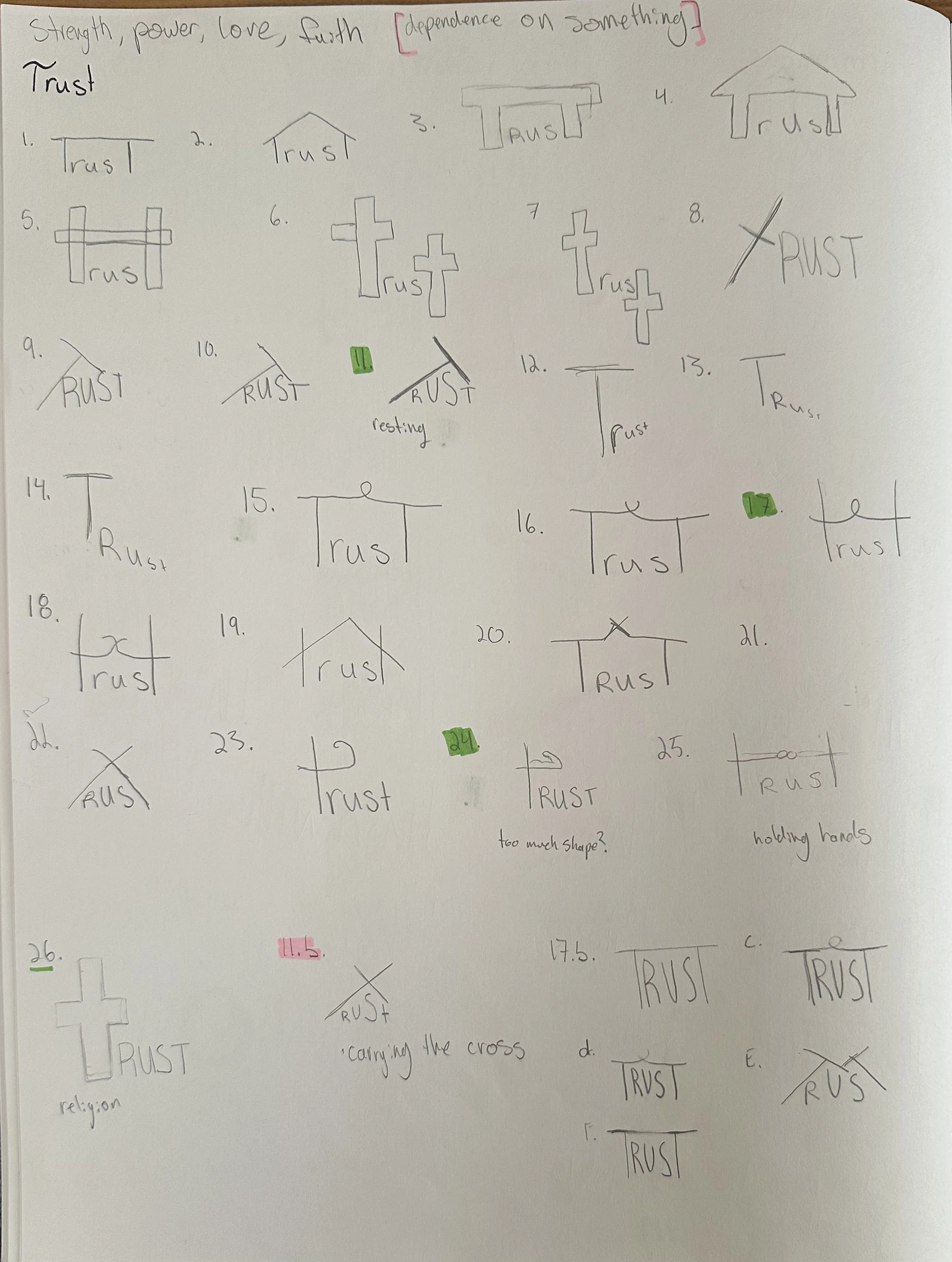
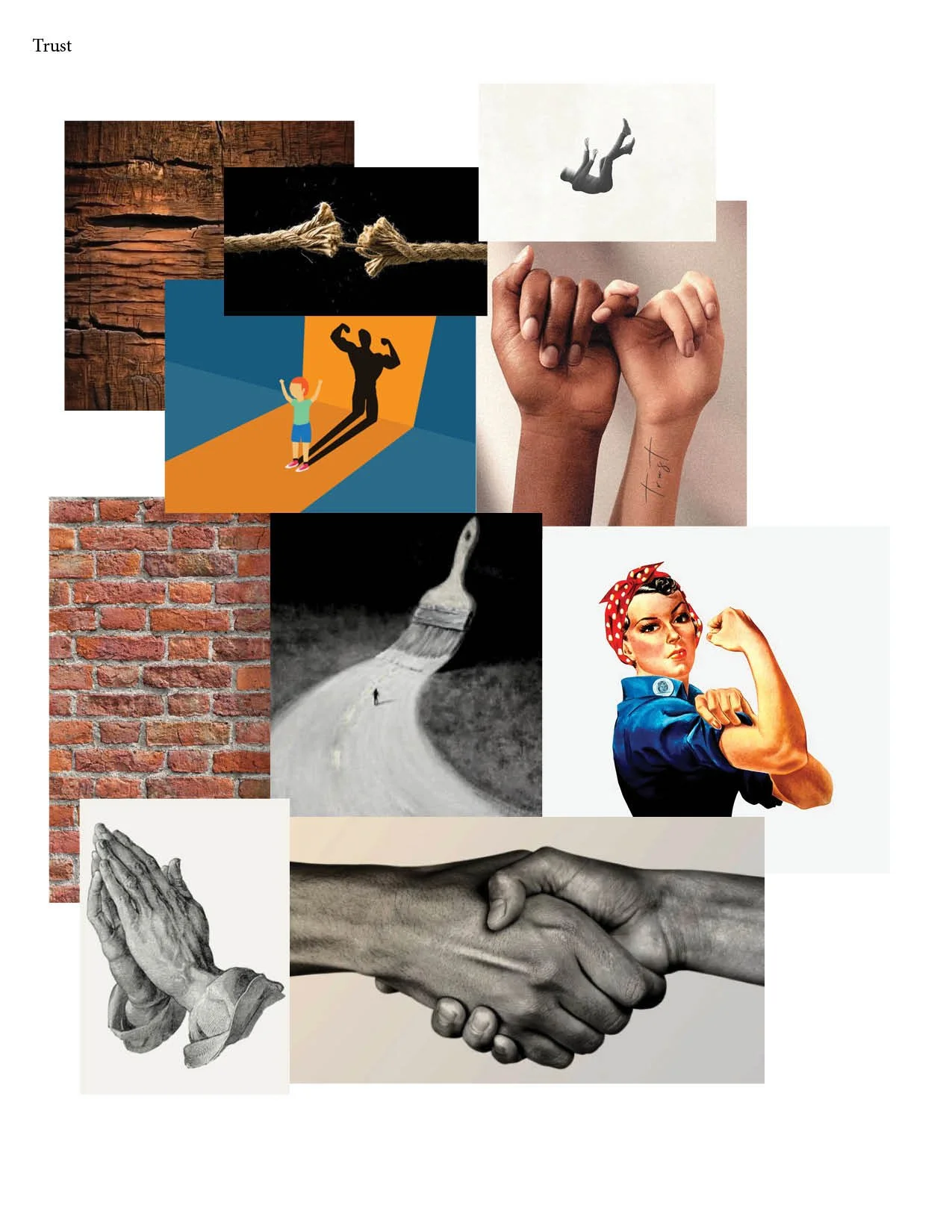
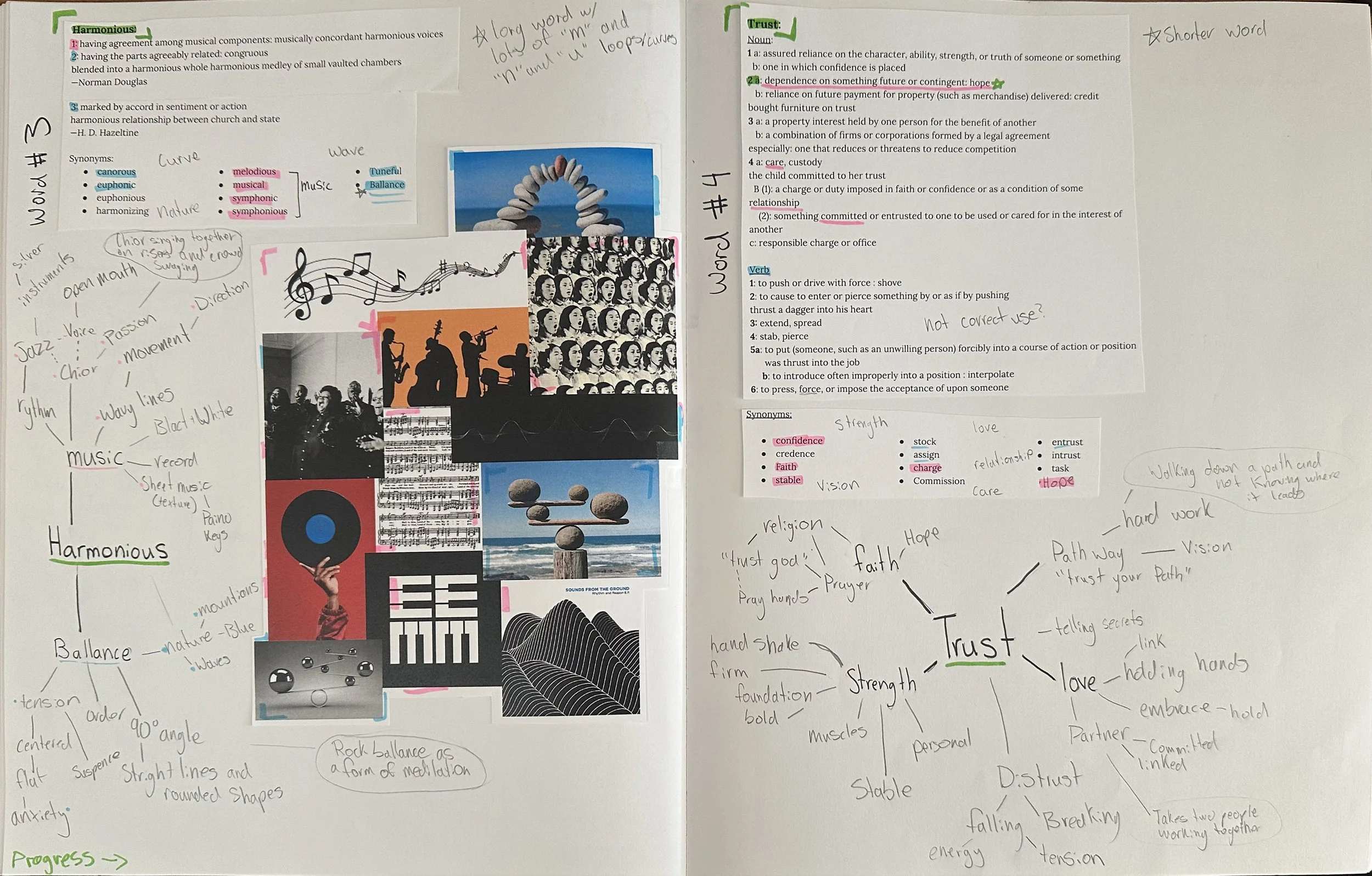
“Trust”
Trust: dependence on something future or contingent: hope
I created a representation of the word trust by resting the leading letter T on the following letters of the word as if assisting in a trust fall. The crossbar of the leading T also represents a cross to reflect the trust that people have in their religion or faith. The customized type based on the font Futura rests on the baseline of the page to create an implied horizon on the reliable monochromatic brown color scheme.

“Placement”
Placement: an act or instance of placing: such as an accurately hit ball (as in tennis) that an opponent cannot return.
To represent the word placement, I moved the “E” of the word into the “C” to create emphasis on location. I also lowered the case of the letter to further contrast. Colors were then drawn from tennis court inspiration to convey the idea of a ball being placed in an exact location.

“Harmonious”
Harmonious: having agreement among musical components: musically concordant
The word Harmonius was represented with a variation of tones and opacities of letters moving up and down to a tune. With meaning drawn from music, the movement draws a connection to music notes.
Typeface
Poster
Research
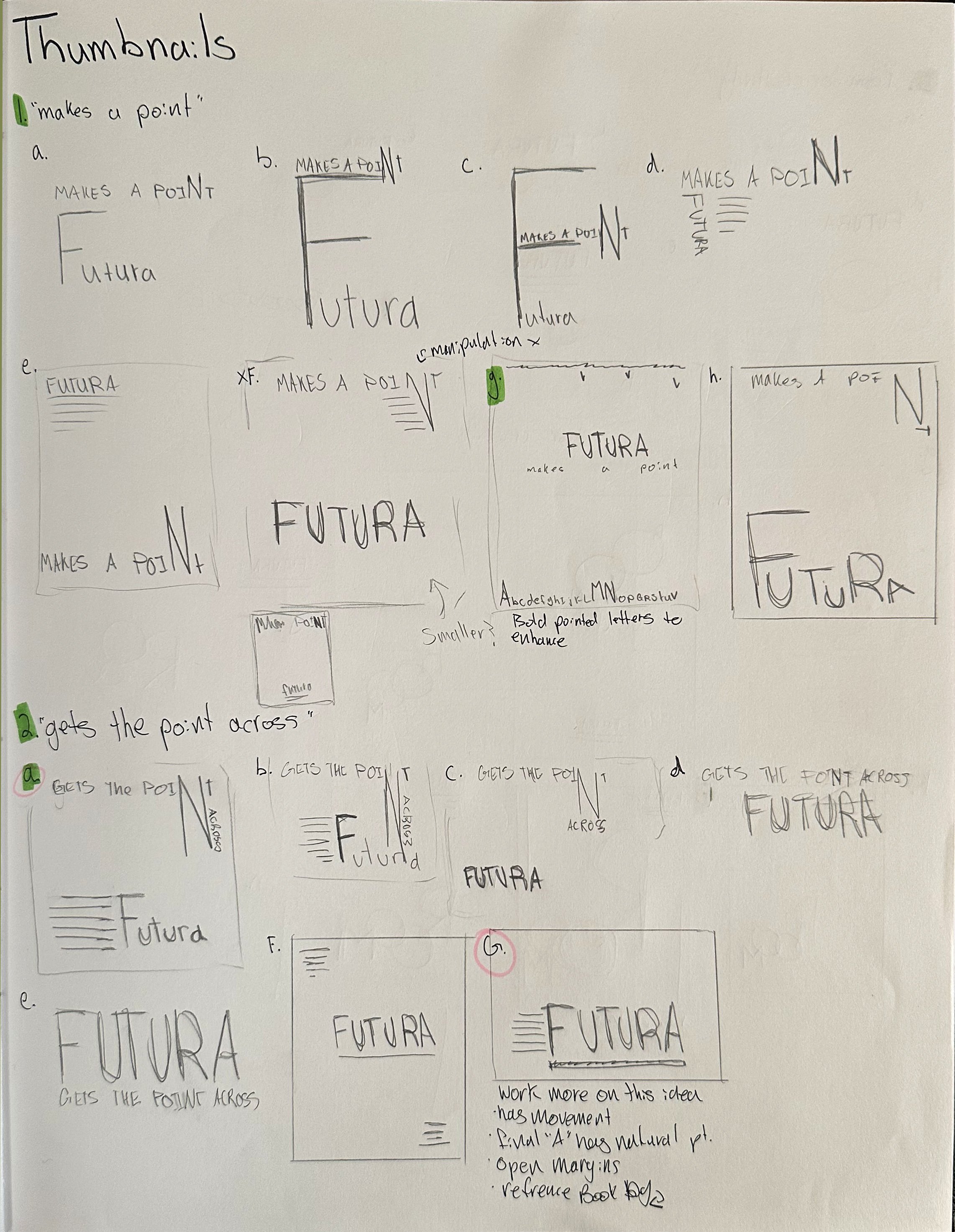
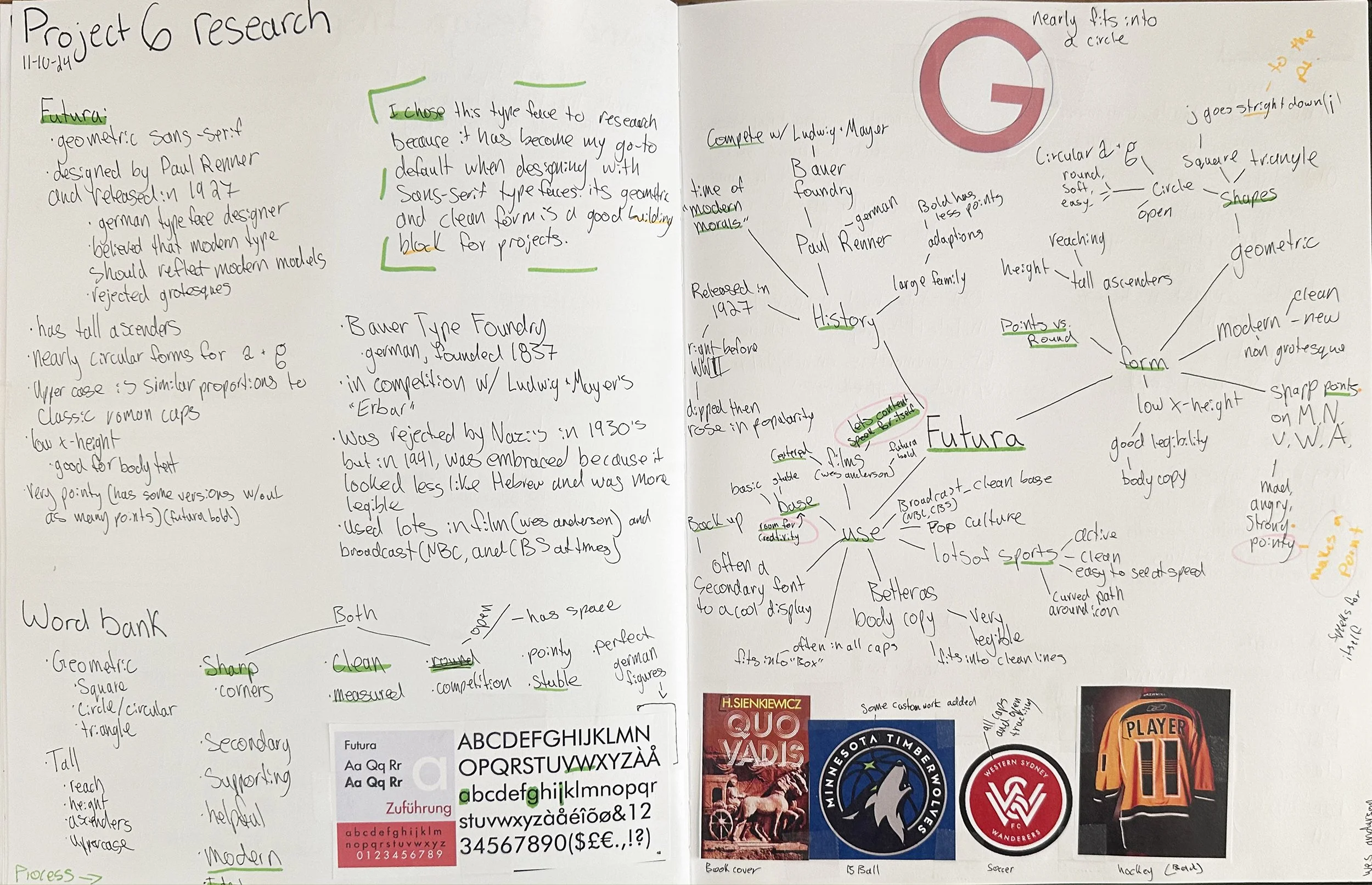
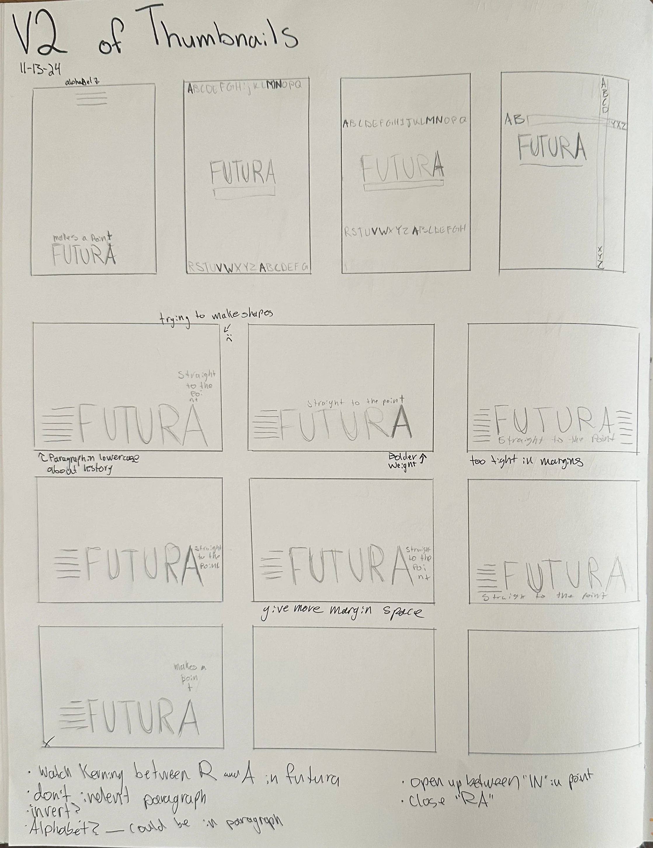
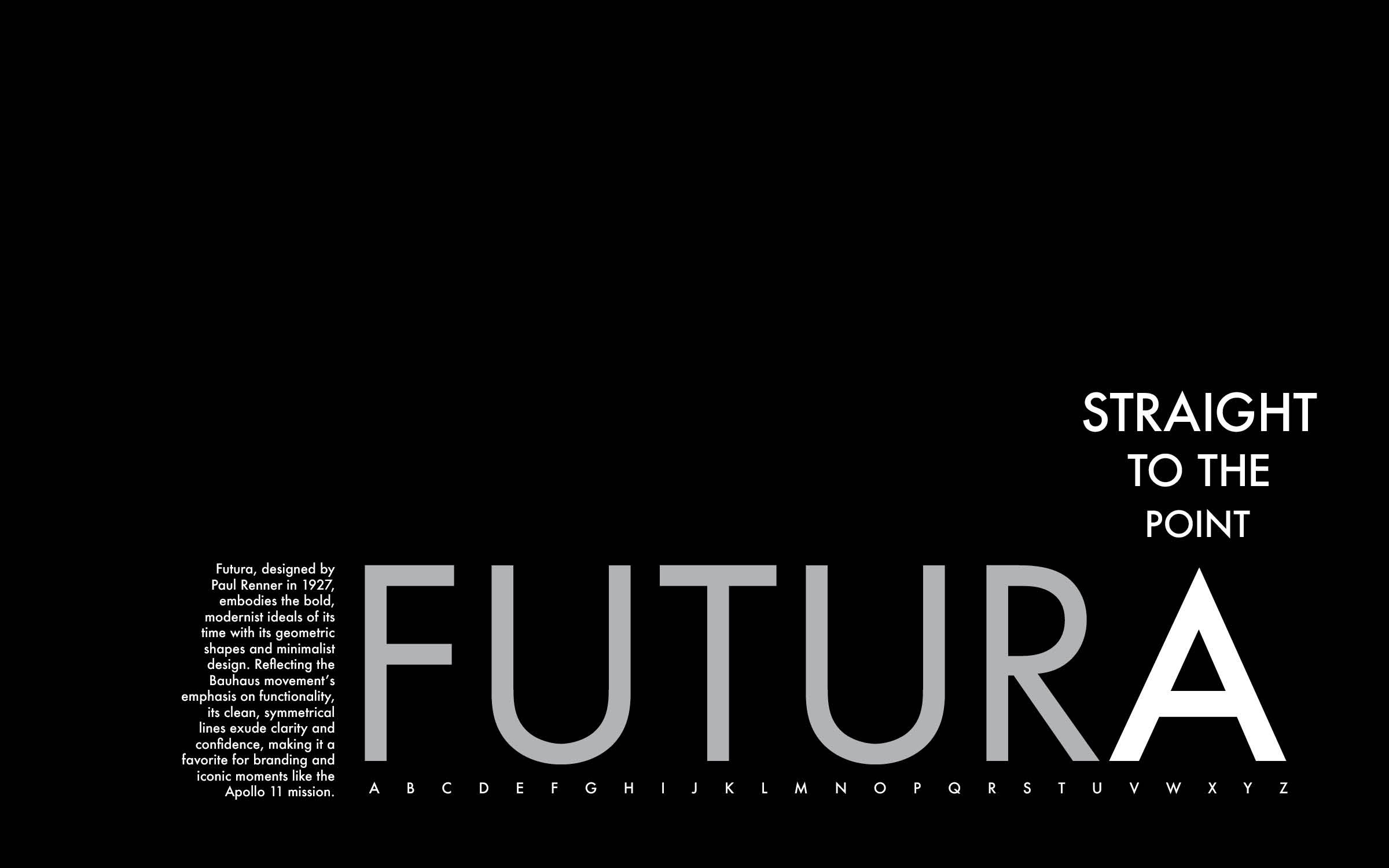
To represent the history and style of the Futura typeface, I designed a poster. By researching the story behind its origin, I learned that the font was designed to represent modern ideals through its clean lines and geometric shapes. The use of the font name in all caps at a large size shows off the crisp corners. Further, the tagline reading “To the point” emphasizes the sharp points on the apex of the “A” and baseline of the “V” and “W”. Finally, the small text on the left side of the page and spelled out alphabet at the bottom of the composition draws the reader into a closer viewing distance. By placing the designs between the baseline and the lower 1/3 line but towards the right side of the page, the idea of forward progress is conveyed similarly to the ideals of the typeface.
Adobe Illustrator
Typography
Concept Devolopment
Research

Recipe
Card Design
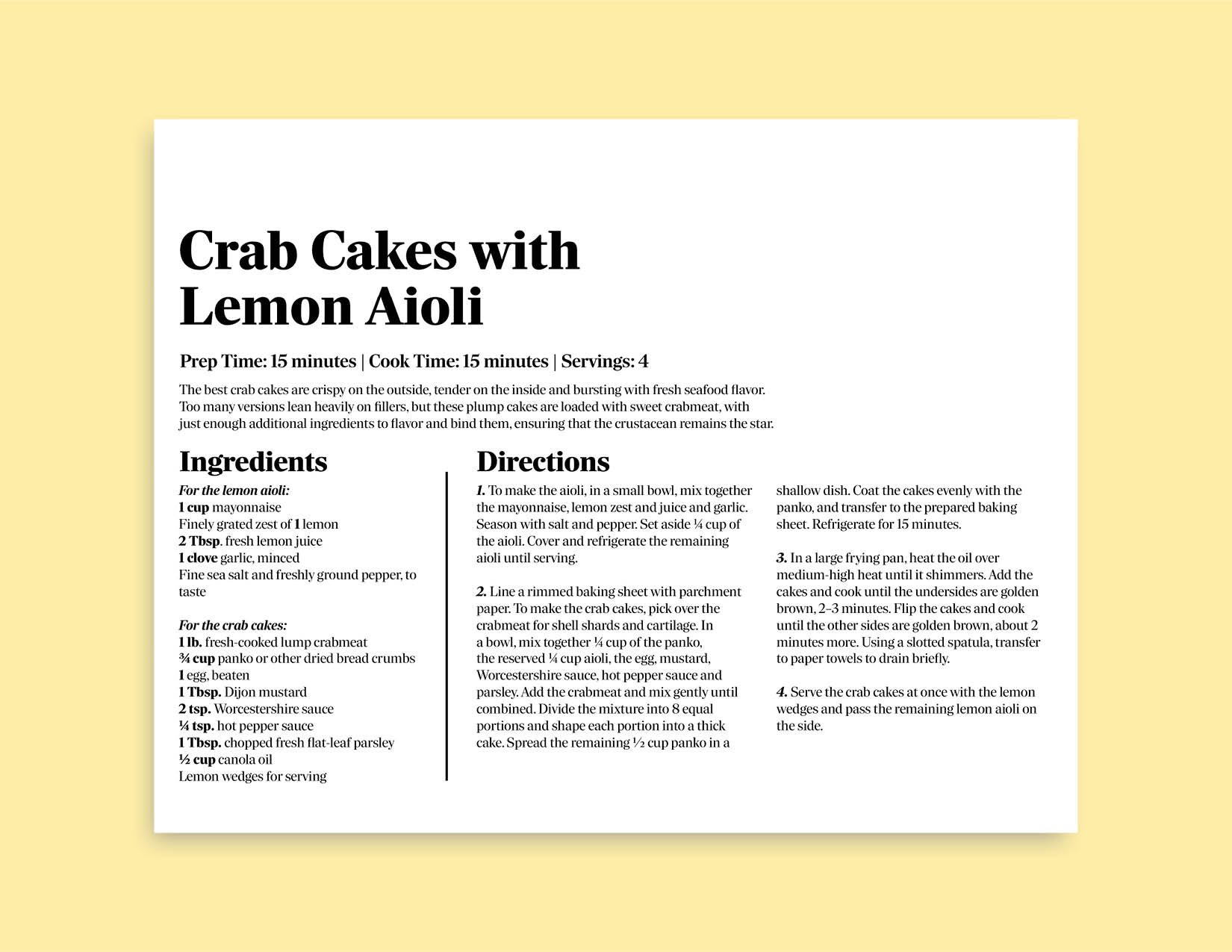
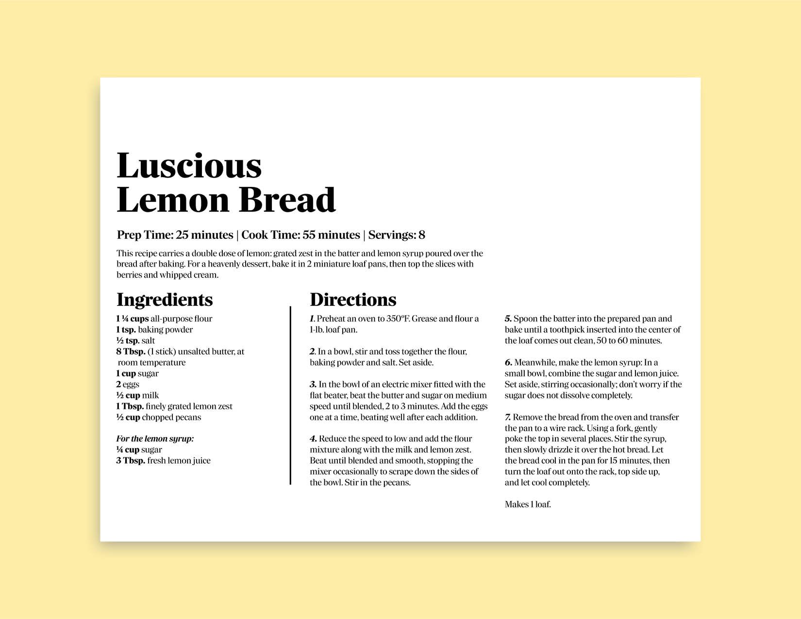
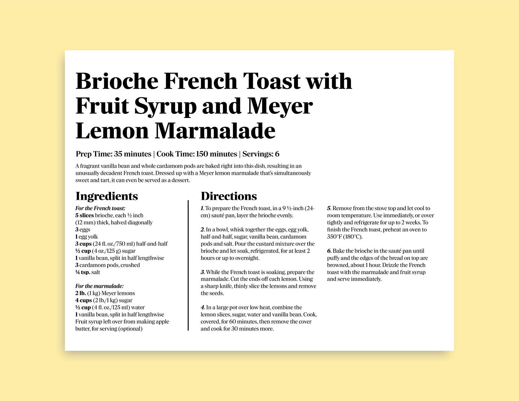
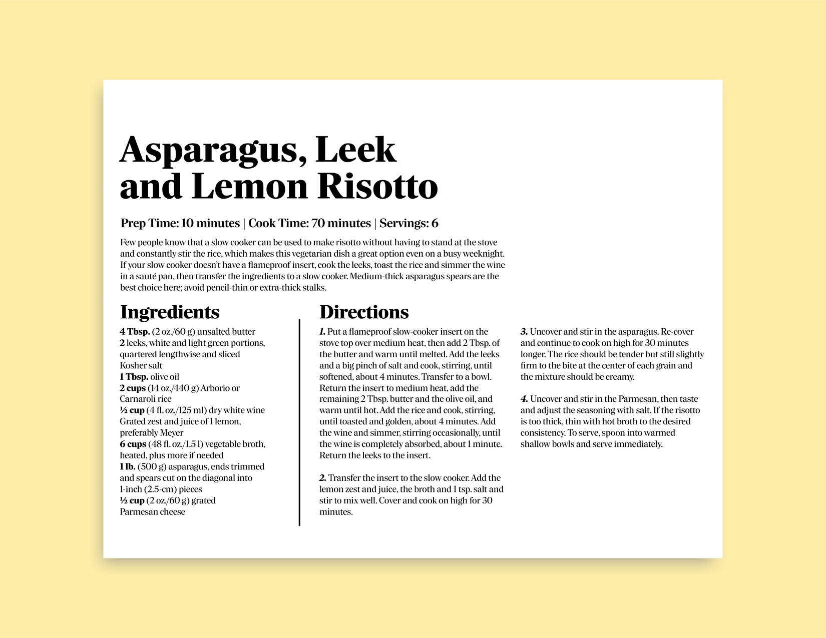
Tasked with 5 recipe cards, I designed a universal card that could house recipes of varying length and detail. I started my process by sketching and considering the most important information. I then refined the sketches to a few final ideas before digitizing the concepts. To keep simplicity, I used one typeface family for the cards with varying weights.
Adobe InDesign
Typography
Hierarchy


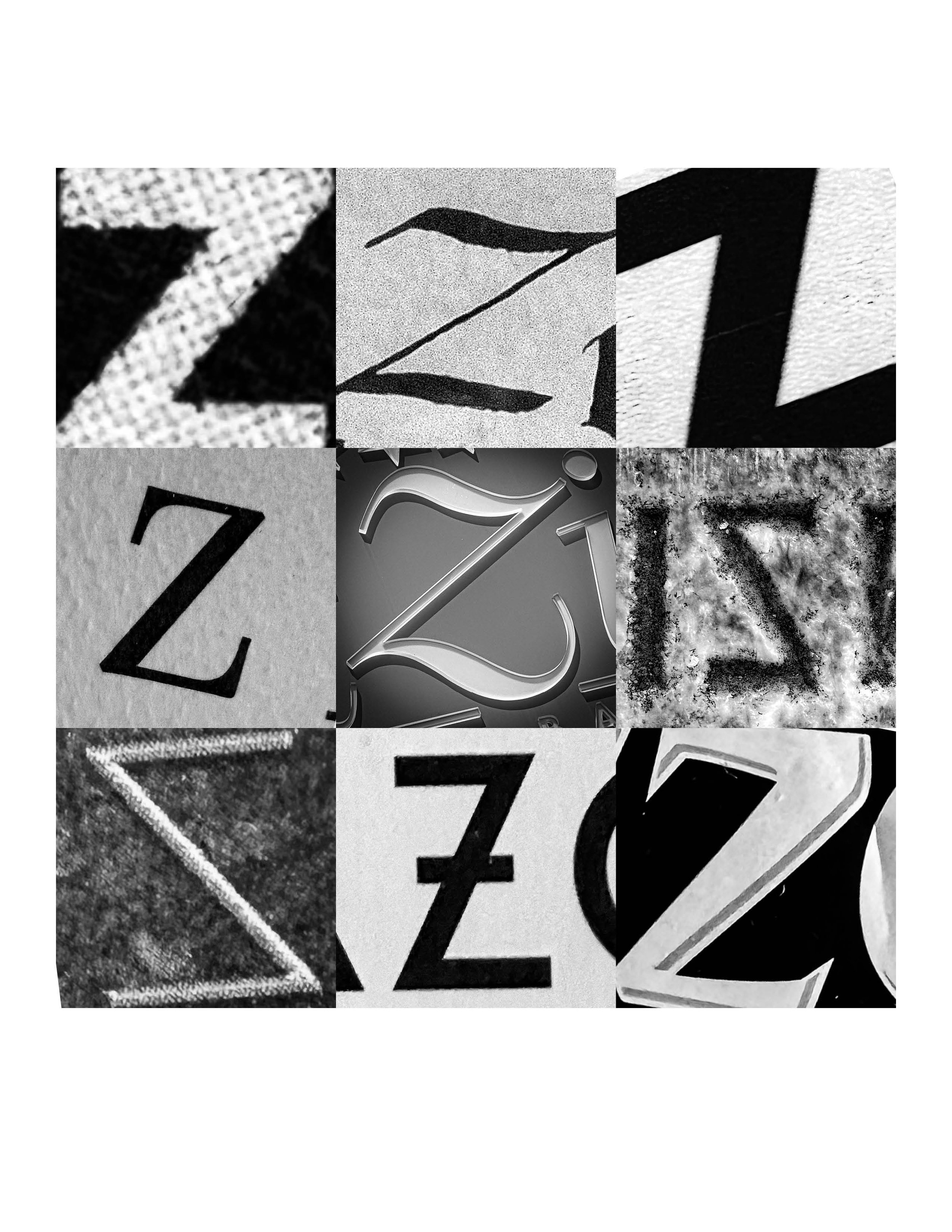
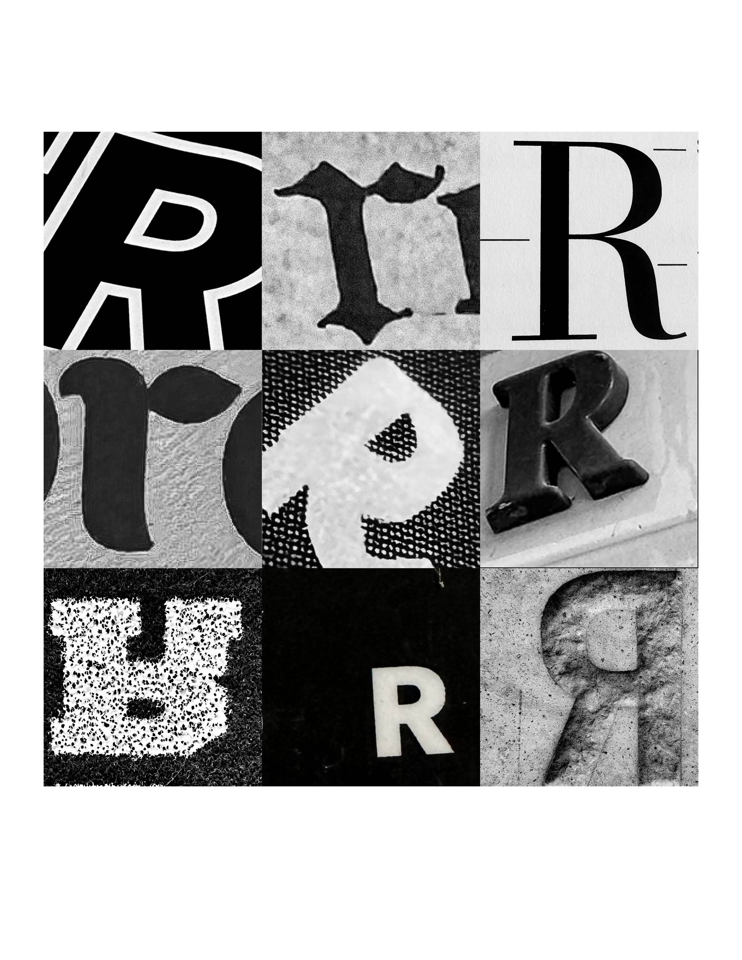
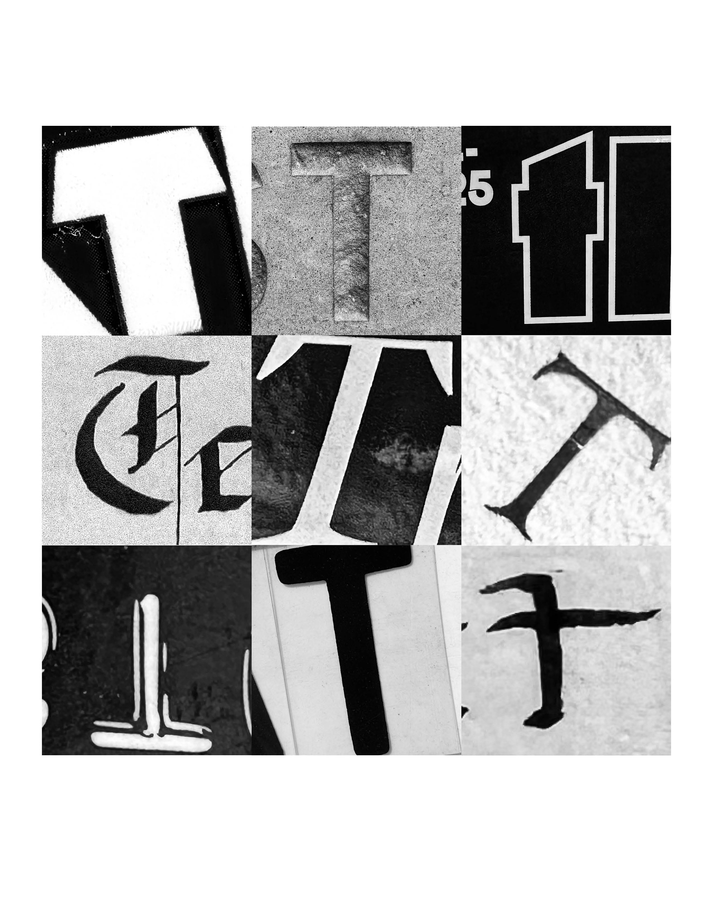
Z, R, T
Found Typography
As an early typography project, I worked to find letters in the natural environment. This could be in the grocery store, book covers, or billboards. By seeking the letterforms out, I opened my eyes to the myriad of fonts that surrounded me. After I filled my camera roll with letters, I cropped and edited the photos before selecting which were my favorites. I then composed the letters in a 3x3 square, balancing the contrast and weight of the letter forms. I was left with three unique compositions that reflect the types that we see in everyday life.
Tyopgraphy
Photography
Adobe Photoshop
Layout Design